
Brain drain – a visual map
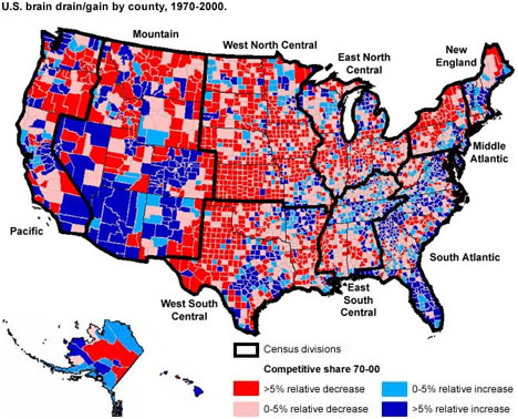
The map above, from a Choices Magazine article, displays U.S. counties’ competitive share for college-educated population as a percent of total population over age 25 from 1970 to 2000 – in other words, brain gain vs. brain drain.
The accompanying study concluded, not surprisingly, that major metropolitan areas enjoyed a relatively large brain gain in every region while the nonmetropolitan, nonadjacent counties suffered brain drain. New England is an exception, with rural areas gaining college-educated workers – attributed to being “amenity-rich – a quality research has shown is important for attracting highly skilled workers.”
The largest migration by far is to the Mountain regions, where affordability/attainability combined with the quality of life/diversity/opportunity of its metropolitan areas prove to be a powerful magnet. What’s extremely important about this particular graphic is that it’s a ‘macrocosm’ of cities in general – your city has a better chance of scoring high in brain gain the more it focuses on providing housing attainability for college graduates at the concentration point for its amenities/diversity/jobs/social life – the urban center.
I’m mystified that you show Valley County, Idaho, where I live, in blue. Local business is dying and housing is not affordable so there must a lot of well-heeled telecommuters moving in here that we locals don’t know about. They cannot all be working for Tamarack Resort.