
Visual map of the beta community process in action
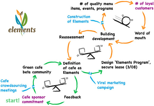
A picture is worth a thousand words, so maybe a diagram is worth at least 500. For those of you who have read about beta communities on this site, but don’t quite understand how they work, maybe this visual map will help.
First of all, it’s a snapshot of an actual project underway – the Elements green vegetarian restaurant and education center in Washington DC.
Notice where one starts! on the path. As each step is completed, the path (arrow) turns green, so you can instantly see how the project is progressing. The scale icon represents a stable, readjusting loop, while the snowball symbolizes a growing, reinforcing loop – this is where you ultimately want to be and where ‘revenue happens’. Notice that the phases occur in loops, as few things really happen linearly in reality – it’s a constant series of readjustments and fine tuning before moving on.
As you can see, Elements is presently at the phase where the beta community needs to design the Elements Program of menu items, events and programs, while the owner/partners need to secure a lease as they let rates fall in the desired district.
Numerous layers can be added, such as visuals of the desired result or the progress itself, or examples of dialogue that convey emotion and concern (“We love our logo! When are we getting the lease already? What organic farmers are we going with?”)
Keep track of Elements’ progress here.
Feel free to ask questions below under ‘Comments’.
Is there any way for you to add a link at the bottom of the page to view previous entries? It’s hard to navigate otherwise. thanks!
You can just scroll down to see the five latest entries, or see the last ten entries under Recent Posts in the right column, or all 1200+ entries under Archives in the top right column, or if you click on the unique URL of the entry, you can see the previous or next entry via a link at the top of the current entry.