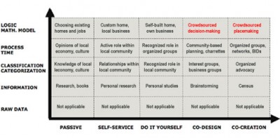
Crowdsourced placemaking – charted

Thanks to the geniuses at ThinkStudio that brought us the direct economy matrix, we’re able to provide a chart that better explains what crowdsourced placemaking is, when people have a direct hand in shaping their built environment.
As in the direct economy matrix, the x-axis represents progressive levels of interactivity, and the y-axis displays progressive levels of knowledge, as explained in The creative economy = the ‘direct economy”. Notice how raw data really doesn’t add up to anything, while true tangible results only happens at the interactivity level of co-creation involving collective intelligence and resources, and the knowledge level of logic, when you understand enough of something that you can capture this into a logical model (e.g. Wikipedia’s structure) that produces tangible results.
What suggestions do you have for improving the chart entries? Please comment below so we can move to the top right of the chart!

If this chart is supposed to make things clear, I can´t imagine how incomprehensible this site was before…Sorry to be sarcastic, but I THINK I am very interested in this and “Beta Community”. Unfortunately I seem to be able to glean more information from other sites talking ABOUT this site, than the site itself! Does there have to be a link to every other word or phrase? Can´t there be more than a short paragraph of information in one place? Please….not everyone has an attention span that lasts only 30 seconds. Can´t we have a page or two article that tells what the heck this is all about? Is this about a group of people connecting online to form a group that interacts with a developer to build the sort of community they want, or isn´t it??
Thanks Tracy,
I’d be more than happy to solve this problem for you and others as well. In the About section, I’ve added a link to a comprehensive report, Crowdsourcing Cool Places for Creatives, on what crowdsourced placemaking is and how and who can help interested parties with implementation.
Your last line sums it up from one perspective. 80% of the contributions actually happen face-face rather than online, but the face-face also can’t happen without the online component. Sometimes the sponsor of the crowdsourced places are developers, sometimes the government, sometimes a business owner, and sometimes the crowd itself. The type of crowdsourced placemaking with the most impact is indeed when a community works with a developer to revitalize an entire neighborhood or district, but it’s also the rarest, or rather, the most difficult to arrange. One such effort involves Renaissance Downtowns in the Northeast.
Let me know how this site can further assist you in determining what you want to know.