
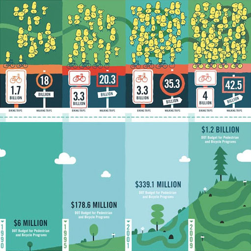
Investment follows the walking, biking crowd
Ah, the effectiveness of graphics, from the socially innovative folks at GOOD.
 Top diagram: The number of pedestrian and biking trips, with each, uh, person representing a billion trips. That last image representing 2009 is starting to represent Manhattan.
Lower diagram: DOT (U.S. Department of Transportation) budget for pedestrian and bicycling programs. More evidence that government (and private sector) investment will follow the crowd, especially when the crowd makes itself known. The graphic above puts the crowd diagram above the government investment diagram, flipping GOOD’s version to better illustrate this. Even GOOD makes it clear that government investment is a response to the crowd.
It’s also a heckuva lot cheaper than building and maintaining roads and bridges, and also better for our deficit than importing oil and cars. There’s a good amount of collective intelligence in them crowds.
Leave a Reply